Soft summer outfits are easiest to put together when the clothes share a muted quality, even when their colors differ. Think faded denim beside a dusty rose shirt, or blue gray trousers with a soft off-white knit. Seasonal color analysis is a subjective styling framework: the label can help narrow a decision, but it cannot tell you what you must wear. Start with clothes you already like, then compare a few combinations in natural light. The useful result is an outfit you want to leave the house in, with enough contrast and structure for your day.
Choose a base softer than stark black
A base color does a lot of work because it covers a large part of an outfit. If black trousers make a muted shirt seem disconnected, try the same shirt with charcoal, washed navy or gray denim. Keep the shoes and accessories unchanged during this comparison. Otherwise a more flattering cut or a different shoe can get the credit for a color decision. Look at the whole silhouette from a few steps away, then check the neckline more closely.
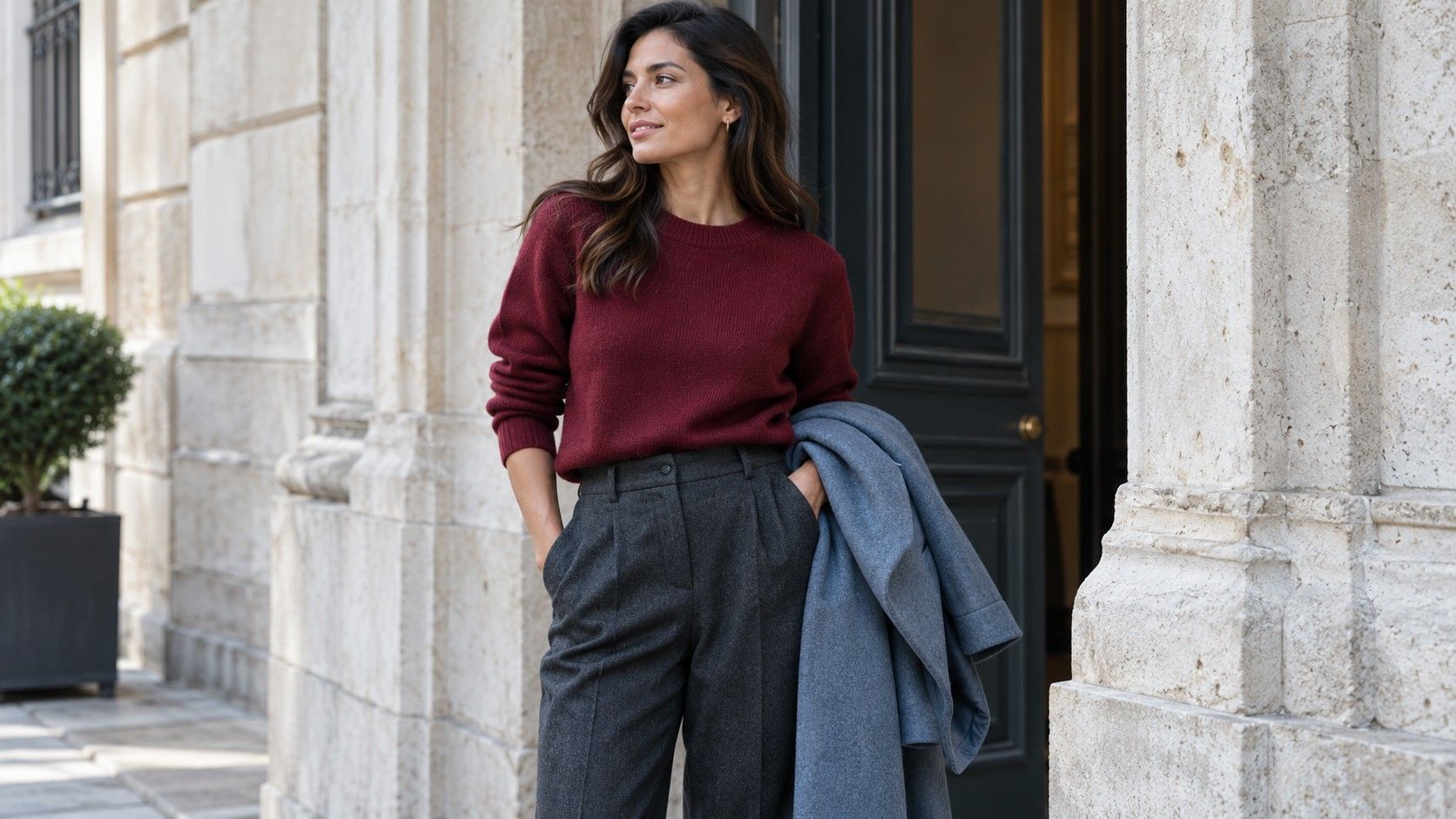
Blue gray trousers, a faded rose cotton top and gray suede shoes make a straightforward starting combination. For a warmer-feeling alternative, use a rose brown skirt with a gray knit and soft burgundy flats. These names are loose descriptions, not standardized paint samples. One shop's taupe may look yellow next to another garment; a blue gray can turn almost violet under indoor lighting. Put the actual pieces together before deciding that their labels match.
There is no need to remove every black item from a soft summer wardrobe. Black jeans can provide a useful dark anchor, particularly with a washed finish. Try them with a smoky blue shirt and a medium-gray cardigan so the change from light to dark happens in steps. A pale top directly against a very dark bottom produces stronger tonal contrast; that may be exactly the effect you prefer. The palette is a starting point for comparison, not a ban on drama.
Texture changes the result too. A matte charcoal knit often looks quieter than shiny charcoal satin, while faded navy denim can read softer than smooth navy tailoring. Check the fabric near a window and in the room where you normally dress. If your available neutral works with several tops, fits comfortably and suits the weather, it has already earned its place. Color refinement should make that useful piece easier to wear.
Build an office outfit with gentle contrast
For a workday that calls for tailored clothes, try medium-gray trousers, a dusty blue blouse and a charcoal jacket. Leave a visible difference between the blouse and jacket so the layers have definition. An outfit can feel flat when every garment is equally pale or equally mid-toned, even if the hues sit comfortably together. A belt close to the trouser color keeps the waist quiet; a darker belt makes it a clearer feature.
A skirt offers another route: pair a rose brown midi with a gray-blue fine knit and dark gray ankle boots. The proportions need a real fitting-room check at home. Tuck the knit fully, tuck just the front, then leave it loose. A slightly shorter top can give the skirt room to move, whereas a long heavy sweater may conceal the shape you wanted. Sit down as well as stand up, especially if the skirt must work through a desk-bound day.
When a workplace expects a white shirt, compare bright white with a softer white if both are available. Keep the version you enjoy and that meets the dress code. A gray jacket or muted scarf can provide a transition around a crisp shirt, but neither is compulsory. Avoid adding an accessory purely to correct an imagined palette mistake. A neat collar, comfortable sleeves and fabric that stays presentable may matter more during a long meeting.
Before settling on the outfit, test it with the actual bag and outer layer. A cool gray suit can change character beside a very orange-brown leather bag; you might like that contrast, or prefer a quieter gray or burgundy accessory you already own. Check the outfit under indoor light after the daylight comparison. Soft summer color palette clothes do not have to produce an identical effect in every room to be useful for ordinary work.
Make weekend denim work with the palette
Denim is an easy bridge because its surface often mixes lighter and darker threads. Start with medium-wash straight jeans, a muted mauve T-shirt and a gray zip cardigan. White sneakers can keep the combination crisp, while gray sneakers reduce the contrast at the hem. Compare both if you own them. The choice depends as much on the mood you want as on whether a shoe appears on a seasonal color chart.
For a weekend lunch, try a faded blue denim skirt with a rose brown shirt, sleeves rolled to a comfortable length. Add a gray jacket if the weather calls for it. For errands, switch to jeans and a blue gray sweatshirt with a more distinct hem. Denim that is heavily distressed or sharply bleached introduces visual contrast even when its overall color looks muted. Consider the markings as part of the outfit, much as you would a print.
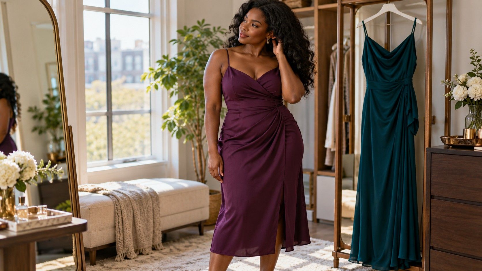
A denim jacket over a smoky plum dress is useful when you need a simple layered outfit. Check where the jacket stops: near the natural waist, at the hip or across the widest part of the dress. Those placements create different shapes. If the jacket feels bulky, try it open before blaming the colors. Roll a sleeve only if it stays put comfortably; an attractive combination that needs constant adjustment becomes tiring very quickly.
Use prints without losing softness
Look first at the area the print occupies and the distance from which you read it. A small rose-and-gray pattern may blend into a muted overall effect, while wide white-and-navy stripes stay graphic. Neither is inherently better. If a patterned blouse feels busy with a textured jacket, try a plain cardigan before changing the blouse. Give one element room to be noticed instead of making every part compete.
Pull one existing color from the print for the bottom half. A blouse with smoky blue, gray and dusty burgundy might pair with gray trousers or faded blue jeans. You do not need an exact match: a slightly darker version can make the combination easier to read. Hold the pieces together in natural light and check whether one turns unexpectedly yellow, bright or muddy beside the other. That relative comparison is more helpful than inspecting each item alone.
Scale matters alongside hue. A large watercolor floral can feel soft because the edges blur; a tiny high-contrast geometric print can feel sharp. Try the garment with a simple shoe and a plain outer layer, then decide whether the print has enough space. A patterned skirt with a gray knit is often easier to balance than a patterned top, scarf and bag together, though personal preference remains the deciding factor.
If you want a quieter result from a favorite bold print, reduce its visible area. A plain open cardigan leaves a narrower panel of a blouse on show, and a tucked top exposes less fabric than one worn long. Do not use that trick if it spoils the proportions or makes you uncomfortable. Softness is one possible styling goal; a lively print can be the reason you enjoy wearing the outfit.
Adapt a favorite piece outside the palette
Keep the garment that makes you happy and test its neighbors. A bright coral sweater can work with familiar gray jeans and simple shoes, even if coral sits outside your preferred muted cool colors. Adding several supposedly corrective items often makes the outfit harder to wear. Begin with one quiet base and see whether the strong color reads as an intentional focal point.
For a camel coat you use daily, try smoky blue or rose brown underneath and leave the neckline simple. A scarf in a color you enjoy can change the visible transition around the face, but it will not alter the coat itself. Compare the coat open and closed, with your actual winter bag. Large outer layers dominate the view outdoors, so judge the combination in the form you will wear rather than only over a chair.
A special-occasion black dress deserves the same practical approach. Gray shoes, soft burgundy details or a muted wrap may create the gentler effect you want. Equally, a clean black outfit may be your preferred choice. Check movement, comfort and the event's lighting where possible. No seasonal label supplies a universal prescription for skin color, and there is no obligation to replace a dress that already serves you well.
Build a small record of successful outfits: one for work, one for errands and one for an evening out. Note the actual garment combinations and any useful adjustment, such as a shorter jacket or a different shoe. That gives soft summer clothes a practical role in your wardrobe. When the label stops helping, return to the mirror, your day's needs and the pieces you reach for willingly.