Cool undertone colors to wear can include much more than blue shirts and gray knitwear. Berry red, blue-green, plum and several quieter neutrals offer different ways to build an outfit. The useful part is comparing their actual versions in your wardrobe, because a color name tells you little about depth, brightness or fabric finish. Undertone and seasonal color labels are subjective styling tools rather than a scientific dress code. Use them to suggest an experiment, then let your taste, the clothes you own and the day's plans decide what stays.
Test cooler versions within the same color family
Begin with two garments that share a color family but differ in direction. A red that leans toward berry may feel cooler beside an orange-red; a green with a bluish cast may look different from a yellowish green. Compare them in indirect daylight near the face, keeping the background and your position the same. You are looking for the effect you prefer, rather than trying to pass a test with a correct answer.
Try to keep depth and brightness reasonably close in the first comparison. A pale dusty pink against a vivid orange-red changes several things at once. You might prefer the softer garment because it is muted, not because of its cooler direction. If those are the only clothes available, use them anyway and note that limitation. There is no need to obtain special swatches or fill a wardrobe gap merely to make a cleaner experiment.
Wear the same bottom and shoes while changing tops. Gray trousers can give a fairly steady base for comparing a berry shirt and a warmer red shirt. Look first at the overall combination from a few steps away, then at the neckline. One may feel sharper, another more relaxed. Neither result proves an undertone, and liking both is entirely useful if the two garments serve different moods or occasions.
Fabric finish can account for a surprising difference. A shiny blue-green blouse catches light more strongly than a matte green cotton shirt, even when the colors seem close. A fluffy knit softens edges that look clearer in smooth fabric. If a hue seems wrong in one garment, keep the possibility open that its sheen, texture or neckline is the feature you dislike. Color works inside a garment, not separately from it.
Choose neutrals with useful depth
Cool neutrals can include charcoal, navy, soft gray and some taupes, but the names cover many shades. Lay your available neutrals together near a window. A gray cardigan might look slightly violet beside a gray T-shirt; a taupe pair of trousers might look warm beside navy. These differences are ordinary. The question is whether they connect the clothes you want to wear, not whether each neutral qualifies for a category in isolation.
Depth gives an outfit its structure. A light gray top with pale gray trousers creates a quieter division than the same top over charcoal trousers. Try both with the same shoes. If the pale outfit feels indistinct, a darker belt, jacket or shoe can supply an edge, though a change of proportion may work just as well. A shorter cardigan or visible waist can distinguish layers without introducing another color.
For a simple work combination, start with charcoal trousers, a soft white shirt and a navy layer. For a casual version, replace the trousers with medium-wash jeans and use a gray cardigan. Check your existing outerwear over both versions. A beige coat or brown bag may introduce a warmer element that you enjoy. You do not have to replace useful accessories to keep the clothes underneath broadly cool-looking.
Choose the neutrals that repeat through your real wardrobe. Two dark navy pieces may be more useful than a theoretically ideal charcoal that matches nothing you wear. Check near-matches on the body, especially where a jacket meets trousers. Slightly different navies can look deliberate when their fabrics differ, while two almost-identical tailoring fabrics may feel awkward to your eye. Your preference is sufficient reason to separate them.
Wear red green and purple as well as blue
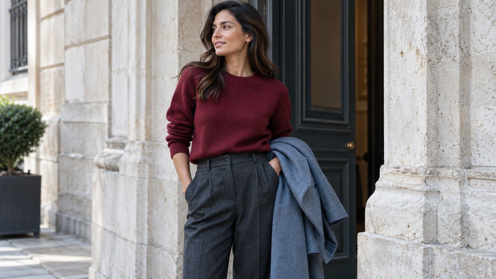
Blue based reds offer an easy way to move beyond blue without abandoning a cooler-looking combination. Try a berry knit with gray trousers and dark shoes, or a burgundy shirt with navy jeans. The first may feel brighter and the second more subdued, depending on the garments. Red names do not describe a fixed formula, so put the actual fabric against the neutral before deciding that the combination works.
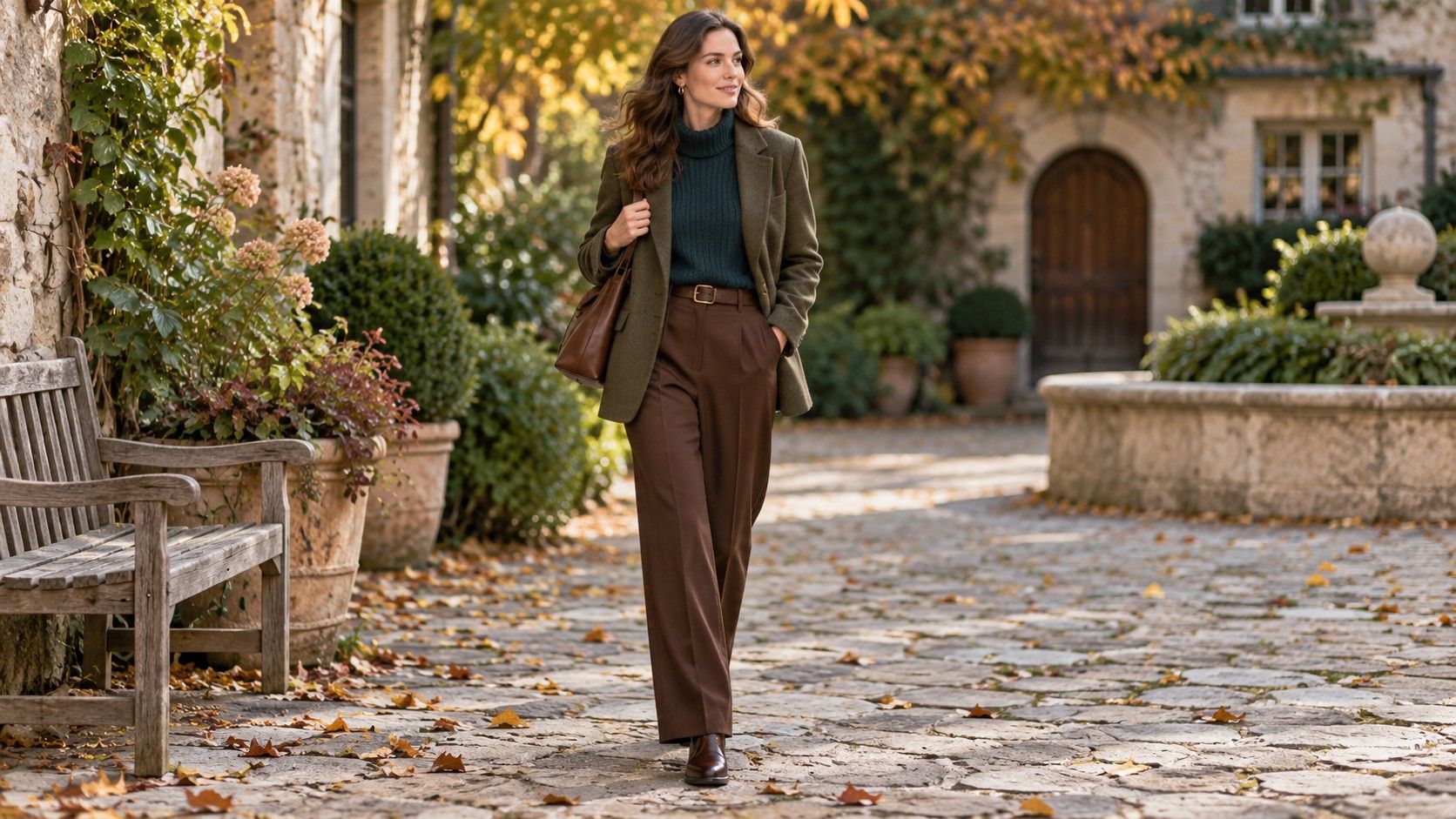
For green, a teal shirt with charcoal trousers gives a practical starting outfit. A muted blue-green cardigan can also sit over a white T-shirt and denim. If the green dominates more than you want, reduce its visible area by opening the cardigan or putting a plain jacket over the shirt. That is an adjustment to the outfit's balance. It does not mean the color was inappropriate for your skin.
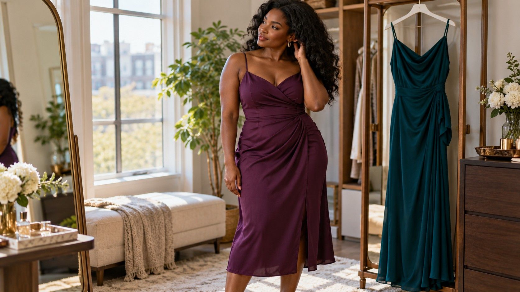
Purple offers a broad range from smoky lavender to deep plum. A lavender knit over dark jeans can feel relaxed, while a plum blouse with gray trousers can work for a more formal day. Compare the top with your actual jacket, because two purple-leaning pieces may bring out differences you did not see on separate hangers. If the layers compete, a simpler gray or navy one can give the colored garment space.
Brightness deserves its own comparison. A clear magenta and a dusty rose may both look cool to you while creating very different outfits. Try the brighter piece with a plain dark base and minimal accessories, then assess the softer one with the same base. You might prefer quiet color at work and stronger color for dinner. Searching for cool skin tone colors to wear is most useful when it expands those options instead of shrinking them to a single uniform.
Keep a warm favorite through placement
A mustard skirt, rust bag or camel coat can remain part of a wardrobe built around cooler colors. Start with the piece you actually enjoy and add familiar companions. A mustard skirt with a navy knit and dark boots gives the warmer color a clear role below the neckline. A rust bag beside gray jeans and a blue shirt introduces a small warm accent. Neither outfit needs to be corrected simply because its elements cross a styling category.
Placement gives you control over visible area. If a warm-colored shirt feels too strong near your face, wear it open over a favorite T-shirt or beneath a jacket. You may prefer the narrower panel of color. Equally, you may find the shirt looks best alone, with no attempt to soften it. Make the comparison on the body rather than assuming a warm garment must always be kept away from the neckline.
Outerwear needs a realistic test. Put a camel coat over the dark base you usually wear, fasten it, then open it. Add a navy scarf only if it is comfortable and useful in the weather. A scarf changes the transition at the neckline; it does not transform the coat into another shade. If you like the coat without it, keep that simpler combination. A practical layer deserves consideration beyond its position on a palette.
Turn comparisons into outfits for the week
Pick three tops that survived the comparisons and pair them with two bottoms you wear comfortably. For example, try a berry knit, a teal shirt and a gray T-shirt with charcoal trousers and jeans. Test each promising pairing with shoes and a suitable layer. Six theoretical pairs may turn into four useful outfits when you account for shirt length, waistbands and the weather. Count the ones you would actually wear.
Give each outfit a job. The teal shirt and charcoal trousers could cover an office day; the gray T-shirt, jeans and a cardigan could cover errands; the berry knit and dark trousers could work for a meal out. Check whether the required shoes are comfortable and whether the layer fits over the sleeves. These ordinary details determine whether a color combination makes it out of the wardrobe.
Take a quick photograph or write a short garment note to preserve a successful pairing. Keep the light reasonably consistent if comparing pictures, and remember that phone processing can alter subtle colors. A record is useful for recalling the outfit, not for diagnosing your complexion. Note any practical issue after wearing it, such as a cardigan that slipped off the shoulders or a blouse that needed constant adjustment.
At the end of the week, keep the combinations you reached for willingly and revise the difficult ones. The solution may be a different tuck, a shorter layer or another existing shoe. Use color-family names when they help, but remember the exact garments that worked. An appealing wardrobe grows from repeatable outfits, including reds, greens, purples and warm favorites alongside the blue and gray pieces you already know.