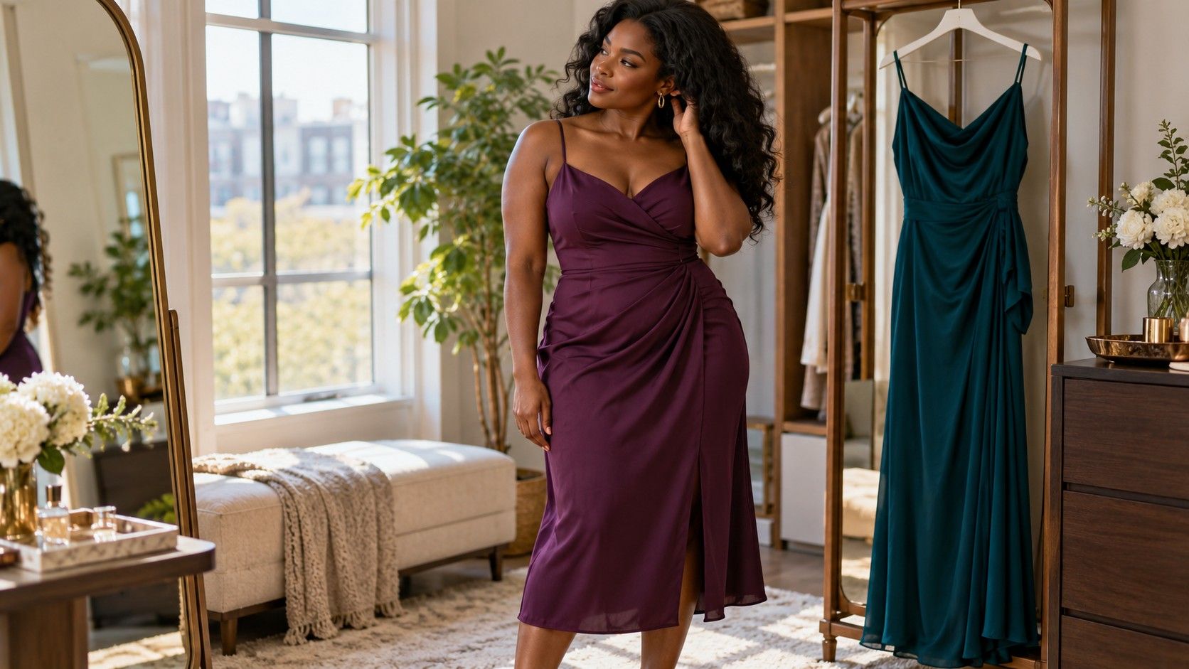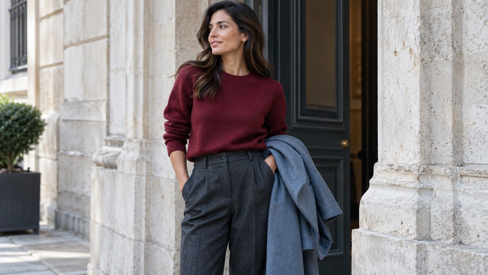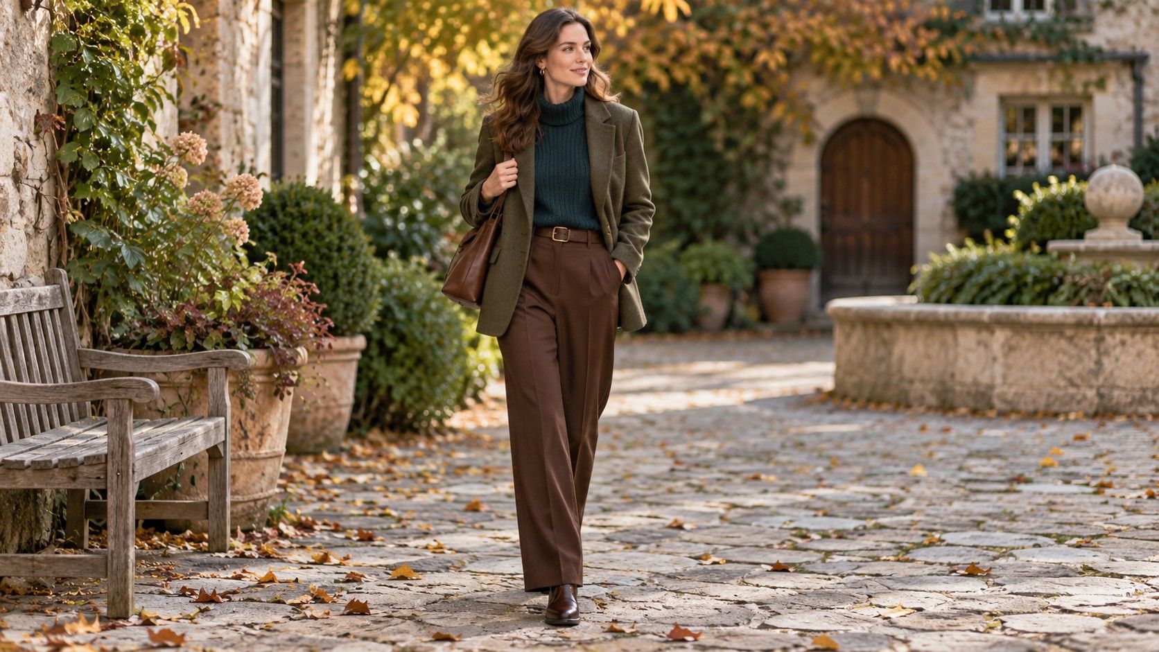
A useful color test for clothes ends with something you can wear tomorrow. It does not need to assign you a permanent palette or explain your face through a photograph. Choose a few familiar garments, compare them under similar conditions, and notice which differences you actually like. The result may be quite specific: a soft blue shirt for work, a cream neckline under a dark coat, or a stronger green saved for evenings.
Set up a comparison you can repeat
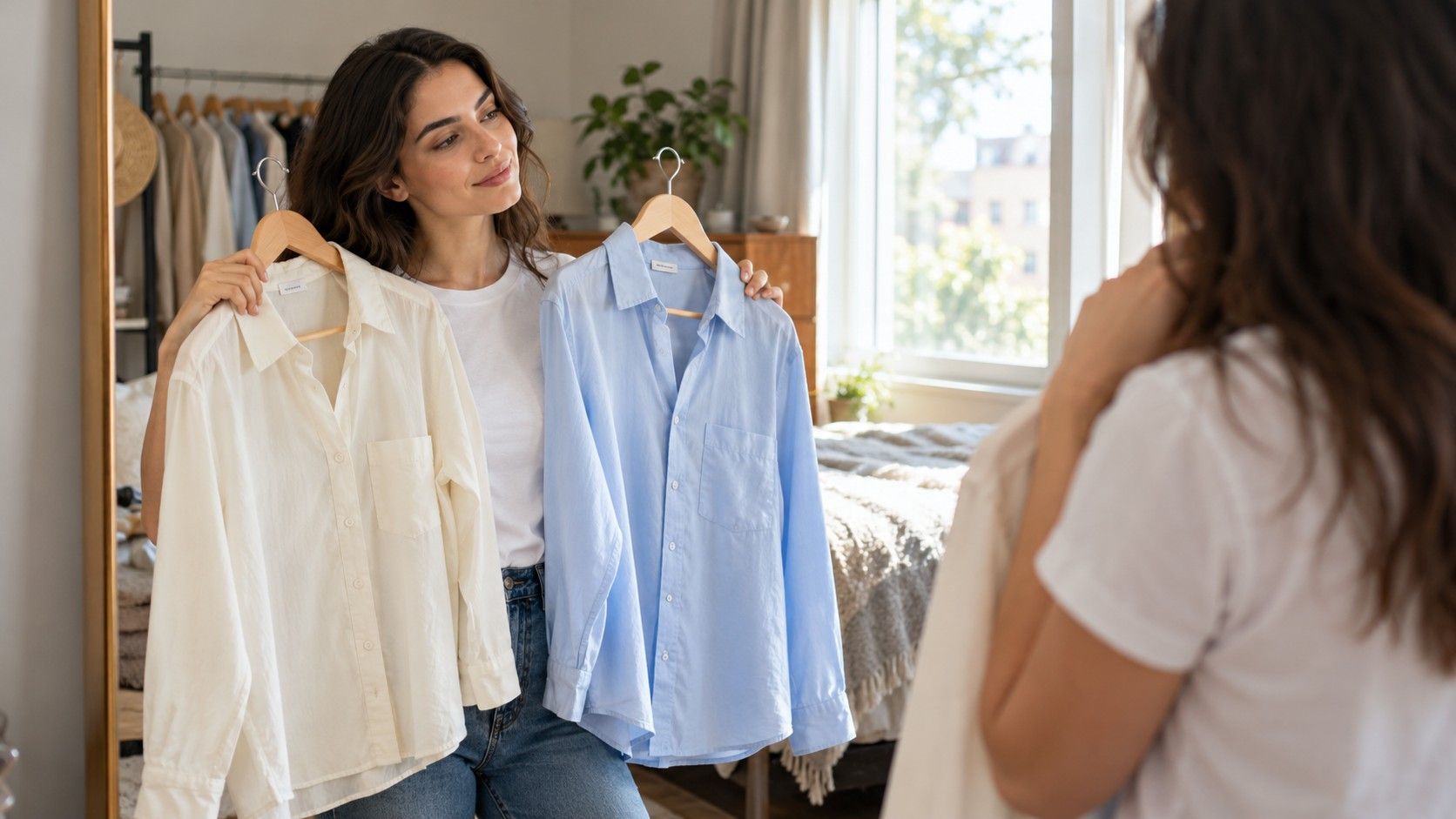
Find a mirror near a window with indirect daylight. Avoid a patch of direct sun on one side of your face and switch off nearby lamps that add a different color of light. A plain background helps because a bright curtain or colored wall can become part of what you are judging. Keep the setup steady so you can repeat the comparison.
Gather six to eight tops or other garments you can hold beneath your chin. Similar necklines and fabrics make the first comparison easier. A cream cotton T-shirt and a white cotton T-shirt tell you more about their color difference than a white satin blouse and a chunky cream cardigan. If your wardrobe has no close pairs, use what you own and note where texture or coverage may be influencing the result.
Wear the same base layer throughout and keep your hair and accessories arranged the same way. If you normally wear makeup, you can compare colors with your usual routine in place; just keep it consistent within that session. The question is how the clothes work with the appearance you expect to have while wearing them.
Hold the first garment at its likely neckline, then swap it for the second. Look at the whole face and upper body before inspecting tiny details. Does the fabric draw all your attention? Does the difference feel calm, lively, severe or simply familiar? Use ordinary descriptions that mean something to you. “I like the softer contrast” is a clearer note than forcing a technical label onto an uncertain impression.
Compare warmer and cooler colors without a vein test
People often start with undertone and then try to classify the veins in their wrists. For choosing a shirt, a direct garment comparison is more useful. Try an ivory top beside a cleaner white, or a rusty red beside a red that appears more berry-like. These pairs show whether you prefer the warmer or cooler version of those particular colors near your face under the conditions you have set up.
Keep other differences as small as possible. A pale peach blouse and a deep burgundy sweater vary in lightness, intensity, fabric and shape, so a preference between them cannot tell you much about temperature alone. A muted terracotta scarf and a similarly muted rose scarf offer a closer comparison. Even then, the result is a preference between two real items, with their own exact shades.
Swap the pair more than once, pausing to look at the plain base layer. If you prefer ivory each time, record it. If the answer keeps changing, write “no clear preference” and move on. Ambiguous pairs do not need a forced winner. Some colors may work equally well, or the distinction may be too small to matter once a jacket and the rest of the outfit are added.
Repeat with a second pair before making a broader wardrobe decision. Liking a warm brown knit does not mean every warm color will suit your taste. You might still prefer a cool blue shirt to a warmer blue-green one. Personal preference, hair color, contrast, garment shape and the occasion all affect what feels right. A small set of useful observations is enough; a universal rule is unnecessary.
Separate lightness from brightness
Lightness describes how pale or dark a color appears. Brightness, as used in everyday clothing talk, often means how vivid or intense it feels. A light gray shirt can be pale and quiet, while a clear yellow shirt can be pale and vivid. Compare these qualities separately when possible. Otherwise, a dislike of one intense shade can turn into an unhelpful belief that all light clothing looks wrong.
For lightness, compare a pale blue top with a darker blue in a similar fabric. Notice the contrast at your neckline and whether you like the amount of visual weight around your face. Then try a muted blue beside a clearer blue of roughly similar lightness. This second pair is closer to a saturation test. You may prefer a dark, quiet color for one outfit and a light, clear color for another.
| Question | Pair to compare | Useful observation | Possible distraction |
|---|---|---|---|
| How much light-dark contrast do I like? | Pale gray and charcoal tops | Which neckline feels more balanced? | A different collar shape |
| How much intensity do I want? | Dusty green and clearer green | Does the fabric or the whole outfit hold attention? | A shiny finish on one garment |
| Which temperature do I prefer here? | Muted rust and muted rose | Is there a repeatable preference? | One shade being much darker |
| Does layering improve the result? | The same top alone and under a jacket | Does a smaller visible area feel easier? | Changing the jacket as well |
Try the less preferred garment with a layer before setting it aside. A vivid purple top may feel overwhelming alone yet enjoyable as a narrow panel beneath a charcoal cardigan. A stark white shirt may feel more comfortable with an open collar or a soft-colored knit. These adjustments change coverage and contrast without requiring a different garment.
Be cautious with phone images during a daylight comparison. Automatic exposure can brighten the face when a dark top enters the frame; white balance can shift when a large colored fabric fills the image. If you take photographs, keep the position and light steady and use them to review the overall arrangement. Confirm subtle color impressions in the mirror rather than treating camera processing as a measurement.
Turn your observations into three complete outfits
Choose one top you consistently preferred and build an ordinary day outfit around it. A soft blue shirt might go with dark jeans and brown shoes you already wear. Check the combination standing up, with the shirt tucked or untucked as intended. The goal is to connect the test with your actual trousers, skirt, shoes and bag, since a flattering patch of fabric does not automatically make a useful outfit.
Build a second outfit for a different requirement. If work calls for a jacket, try the same shirt under navy tailoring, then check how much blue remains visible. Or pair your preferred ivory knit with charcoal trousers and the shoes needed for your commute. A successful neckline can lose its effect when a high scarf covers it, so include outerwear in the final look.
Use the third outfit to test an uncertain item in a smaller role. A bright coral top that felt too strong by itself might work beneath an open denim shirt. A dark green scarf can bring color to a gray coat without becoming the largest area near the face. Keep the rest of this outfit familiar. That makes it easier to decide whether the new proportion has solved the original hesitation.
Write down complete combinations and one reason each worked. “Pale blue shirt, navy trousers, brown shoes; enough contrast for the shirt to show under the jacket” gives you a useful reference. Avoid a notebook full of approved color names detached from clothes. The finished outfit is what you will need on a busy morning, and details such as sleeve length or an open collar may be part of its success.
When a quiz result and your mirror disagree
If you arrive from a “what color clothes look best on me quiz,” treat the result as a set of comparisons to try. A quiz may suggest muted colors, but your own clear green shirt may still be a favorite. Check it against a quieter green under the same light. You can keep the observation that survives the comparison without accepting every restriction that came with the label.
The question “what color clothes look best on me” also contains a personal choice about the effect you want. A low-contrast outfit may feel restful for a long workday. A stronger neckline may be exactly what you enjoy for dinner. Looking understated and looking striking are different goals, and neither has to win permanently. Name the occasion before deciding that one color is better.
If the mirror keeps giving different answers, check the conditions before repeating the whole exercise. Has daylight faded? Did one top change your posture because its fit is uncomfortable? Are you comparing a freshly ironed shirt with a stretched old T-shirt? Stop when fatigue makes every difference seem important. Return to two close garments another day and allow an uncertain result to remain uncertain.
Keep clothing that you enjoy even when it sits outside the pattern you noticed. A useful wardrobe allows room for a favorite print, a practical coat and a color chosen for its mood. Repeat the test when an actual decision arises, such as finding a neckline for that coat or choosing between two shirts already at home.