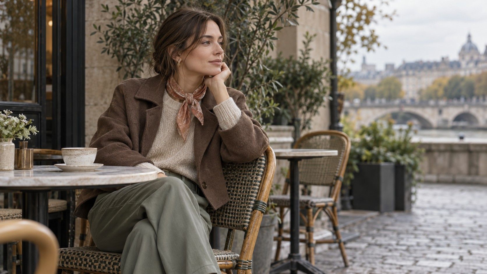
Muted warm colors can make an outfit feel easy, but several similar shades sometimes merge into an indistinct whole. A sage knit, oatmeal trousers and a mushroom jacket need a little separation to show their shapes. Soft autumn is useful here as a loose palette idea: gentle warmth, softened colors and manageable contrast. Treat the clothes in front of you as the starting point, then adjust their lightness, texture and proportions until the combination feels finished.
Choose muted warmth without losing the color
A soft autumn color palette clothing search often turns up rows of beige, brown and green. The garments matter more than the swatches. Sage can be almost gray or distinctly yellow-green; mushroom may lean pink, gray or brown. Put two pieces together in indirect daylight before deciding that their names make them compatible. A warm oatmeal sweater can reveal a cooler cast in trousers you had always called beige.
Begin with one colored garment and one neutral. Try a dusty peach shirt with mushroom trousers, keeping shoes and outerwear out of the first comparison. If the peach disappears into the trouser color, add a lighter neckline layer or exchange one piece for a darker shade already in your wardrobe. If the peach looks unexpectedly bright, compare it with a quieter neutral rather than adding another colored garment immediately.
Muted does not have to mean barely visible. A medium olive cardigan can give an oatmeal outfit a clear center without becoming vivid. Likewise, a soft brown trouser can ground a pale sage top. The useful distinction is whether the color feels softened beside the other pieces, not whether it falls inside a particular named season. You can enjoy the combination without diagnosing your own coloring.
Look at the fabric surface before blaming a shade. A faded cotton shirt may appear flatter beside brushed wool, while satin can give a dusty color a much brighter presence. Hold the garments vertically and let them fall as they would when worn. A color that seemed dull on the bed may gain definition from folds, seams and the light across its surface.
Create visible layers in a tonal outfit
Low contrast works best when the outfit still has readable edges. With oatmeal trousers and a similar knit, try a mushroom belt or a darker brown shoe. These details give the eye a boundary without cutting the body into strong blocks. If you prefer no visible belt, a partial tuck or a shorter sweater can show the trouser waistband and change the outline instead.
Choose one difference to emphasize. A smooth cotton shirt under a ribbed cardigan introduces texture; a light sweater under a deeper brown jacket introduces value contrast. Adding both may work, but testing them separately makes the result easier to understand. A head-to-toe beige outfit often needs only one clear change of surface or lightness, rather than a collection of extra accessories.
Proportion can rescue shades that seem too similar on hangers. An open sage shirt worn over an oatmeal top creates two narrow vertical panels, with the lighter center remaining visible. Buttoning the same shirt may make it the main color and hide that separation. Try both before rejecting the pieces. The amount of fabric on show is part of the color relationship.
| Starting combination | What may feel unclear | One adjustment to try |
|---|---|---|
| Oatmeal sweater and trousers | The waist and layers merge | Show the waistband or add a medium brown belt |
| Sage shirt and mushroom jacket | Both occupy a similar middle value | Leave a pale inner layer visible at the neckline |
| Dusty peach blouse and tan skirt | The colors seem flat together | Compare a textured brown shoe with a smooth tan one |
| Soft brown dress and cardigan | The cardigan shape disappears | Wear it open or change to a lighter knit |
Step back far enough to see the whole silhouette after each change. Close inspection can make tiny differences between yarns seem more important than the outline. If the layers remain clear from across the room, the outfit does not need a stronger accent simply to prove that its colors were chosen deliberately.
Use denim and prints to connect familiar pieces
Denim is a useful bridge when an entirely warm tonal outfit feels too quiet. A faded medium blue jean separates a sage sweater from brown shoes and adds a cooler note without demanding another matching blue item. The wash makes a difference: very dark denim creates a stronger base, while a pale wash lightens the whole combination. Use the jeans that fit the day and adjust the top accordingly.
A patterned scarf or shirt can connect several colors you already own. Look for an actual detail repeated in the other garment: an olive line in a small check, a peach shape in a floral print, or a brown stripe beside oatmeal. Exact matches are unnecessary. A small shared color often gives enough continuity, particularly when the print sits near the point where the two plain colors meet.
Check the background of a print as carefully as its colored details. A pattern with a stark white ground may look much crisper than the rest of a soft outfit, even if it includes sage and peach. That difference can be pleasing. If it feels too sharp, try showing a smaller area beneath a cardigan or swapping the patterned layer for a softer-background piece you already have.
Keep one area quiet when a print is doing the connecting. An oatmeal trouser with a muted patterned shirt can work with plain brown shoes and a simple bag. Adding a second busy scarf may hide the very relationship that made the outfit coherent. Compare the full look with and without the extra item before deciding which version feels more natural.
Give the same colors a different level of formality
For a meeting, the cleanness of the garment lines may matter more than adding a darker color. A pressed mushroom trouser, dusty peach blouse and structured brown jacket can read as composed while staying relatively low in contrast. Check how the blouse sits beneath the lapels and whether its collar bunches. Those small practical details can make a soft palette appear sharper.
For a relaxed day, reuse the blouse with faded jeans and an oatmeal cardigan. The peach is unchanged, but its companions alter the mood. Roll or unroll the sleeves depending on the weather, then check that the shirt hem and cardigan length leave a shape you like. Color consistency does not require identical styling across work, errands and a meal with friends.
An evening variation can come from surface and scale. A smooth olive skirt with a fine oatmeal knit has a different effect from olive cotton trousers and a chunky sweater. A single polished buckle, pendant or earring can add a little light. Compare that small shine with the rest of the outfit; several large reflective pieces may create more contrast than the clothes themselves.
Outerwear still counts. A dark practical coat will cover much of a soft tonal outfit, so let a little of the preferred neckline or scarf show if you want the palette visible outdoors. When the coat comes off, the outfit beneath should stand on its own. Check both versions, including the shoes you need for walking, instead of evaluating an indoor arrangement that you cannot wear on the journey.
Identify the missing role before changing your wardrobe
After trying a few combinations, describe the obstacle in ordinary terms. Perhaps every top is the same medium lightness as the trousers, or each available shoe creates a darker stopping point than you want. That is a useful finding. “I need a lighter layer to show beneath this jacket” gives you a clear styling problem to solve with existing clothes before attaching importance to a palette label.
Move pieces between their usual outfits. The ivory shirt reserved for work may supply the light center an oatmeal cardigan needs. Brown boots worn mainly with denim may anchor a sage skirt. Lay out two or three complete combinations, including bags and layers, and see which garment is doing a job repeatedly. This reveals useful wardrobe connections more clearly than sorting every item into approved and rejected piles.
Keep notes about the combinations that worked, including the detail that made the difference. “Sage knit, mushroom trousers, brown boots; knit tucked at the front” is repeatable. “Soft autumn outfit” leaves out the proportions and practical decisions. A photograph can record the shape, although camera white balance may alter the subtle warmth of the colors. Trust the daylight garment comparison for those differences.
Leave room for favorites outside the palette. A black coat or a clear blue shirt can remain useful even if it produces stronger contrast than the tonal combinations you tested. Wear the softer colors where you enjoy them and let function and preference guide the rest. The purpose of the exercise is a group of reliable outfits, with enough variety to suit your actual days.