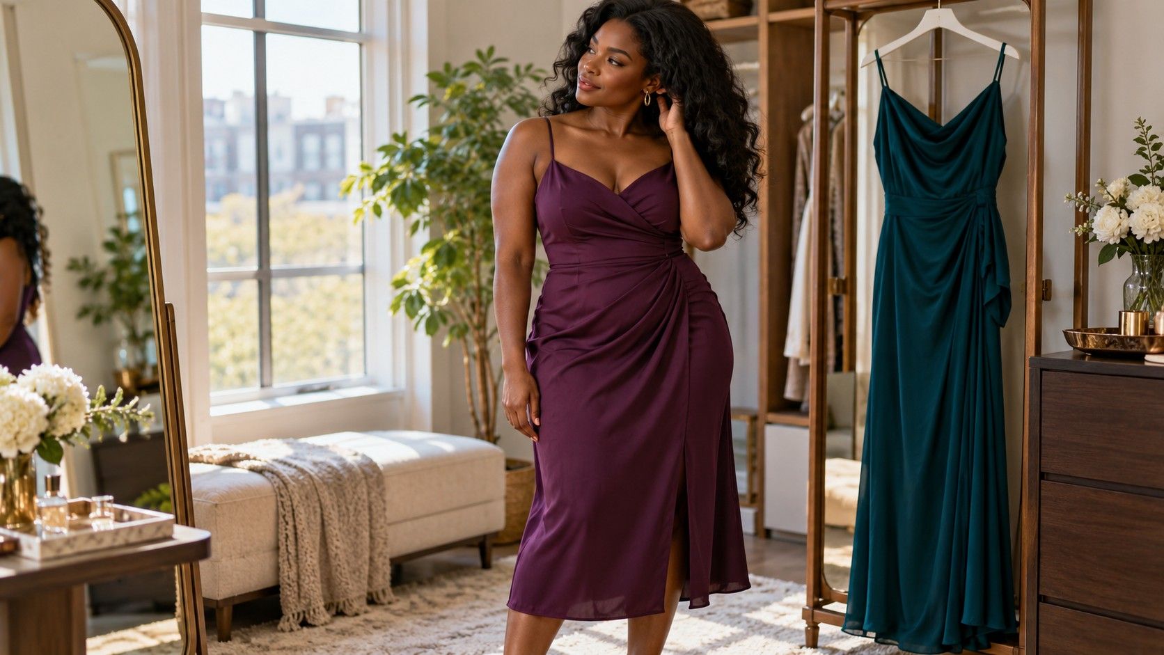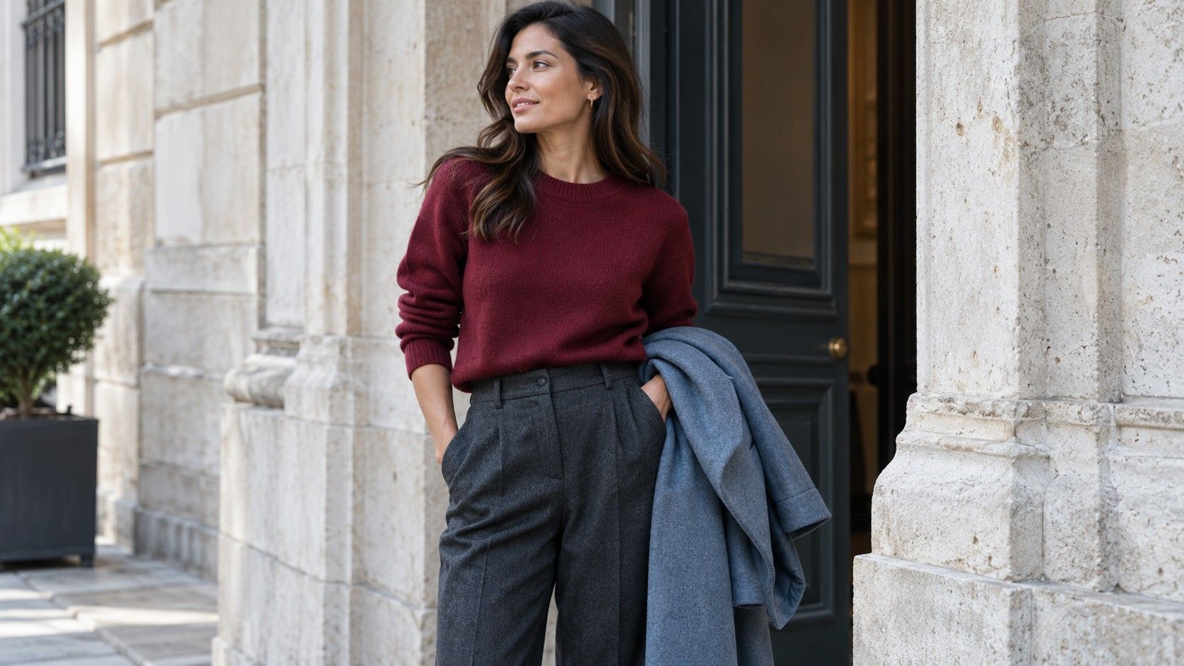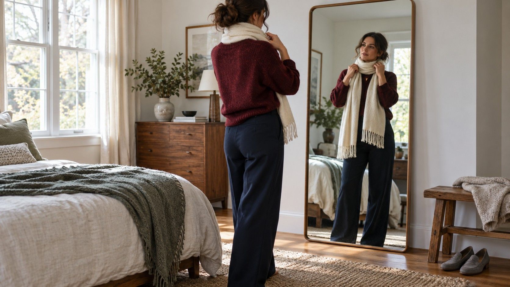
The trousers fit, the sweater feels right, and the two still look awkward together. Usually the answer is a small adjustment: a quieter shoe, a lighter layer, or less of the strongest color. A useful color matching guide for outfits starts with the actual garments on your chair, including their texture and shape. Work through one combination at a time, and keep the changes small enough that you can tell which one helped.
Start with the piece you will actually wear
Choose the garment that has already earned its place in the day. That might be the navy trousers suitable for a meeting, a burgundy skirt you want to wear to dinner, or the waterproof olive jacket needed for a wet commute. This becomes the anchor color. It gives the other choices a reference point and prevents an outfit from changing direction every time another drawer opens.
Put that piece beside two possible partners, without adding accessories yet. With an olive jacket, compare a cream sweater and a charcoal sweater over the same blue jeans. Cream creates a clearer light area beneath the face; charcoal makes the whole combination more subdued. Neither choice needs a seasonal label. Decide whether you want a lighter, more open-looking outfit or a darker, less contrasted one for the occasion.
The amount of each color matters as much as its name. A burgundy scarf occupies a small patch; a burgundy coat dominates most of the visible outfit. If the anchor is already large and strong, let the next large garment be quieter. Burgundy trousers with a soft gray knit leave room for the trousers to carry the color. Adding an equally vivid orange coat creates a different, more emphatic result.
Keep the practical requirement visible during the comparison. A pale trouser might improve the balance but be inconvenient for a muddy walk. In that case, use a cream top or a lighter scarf with the dark trousers you need. Color matching becomes useful when the finished combination still works for the weather, movement and level of formality you expect.
Find out why two good colors look unsettled
Start with lightness, also called value. Navy and black can sit so close in value that their difference looks accidental, particularly when the navy is very dark. A pale blue shirt showing at the collar or a medium gray knit between them can make the layers easier to read. You can also keep the dark pairing and use texture: a matte black trouser beside a ribbed navy sweater has a clearer distinction than two smooth fabrics.
Next consider saturation, the intensity of a color. A very clear cobalt top and a dusty rose skirt can look uneven because one is vivid while the other is muted. Try the cobalt with charcoal first, then the rose with a faded blue shirt. This comparison reveals whether you dislike the original color relationship or simply prefer each piece with a partner of a similar intensity.
Temperature can explain another near miss. A creamy yellow-beige trouser and a cool pink-beige jacket share a general label but may pull in different directions. Add an ivory shirt and see whether that difference feels interesting or distracting. If the shirt makes the mixture look busier, switch one beige piece for gray, navy or denim. Naming both garments beige does not require them to agree.
Fabric changes the effect again. A shiny satin green skirt catches light differently from a brushed green knit, so an apparent match on hangers may separate strongly when worn. Check the pieces upright, with the fabric falling naturally. Before rejecting the colors, try moving one to a smaller area or changing the layer between them. One alteration is easier to judge than a complete reset.
Give a three-color outfit a clear order
Three visible colors can work well when each has a job. Use a main color across the largest area, a supporting color for the next garment, and a smaller accent. For example, navy trousers and a navy cardigan form the base, a cream shirt opens the center, and a rust scarf adds one warm detail. The scarf does not need another rust item to justify its place.
A color chart for clothes is most helpful as a place to start this comparison. It cannot show the exact wash of your jeans or how much of a shirt appears beneath a jacket. Use the pairings below as practical trials, then adjust the proportions in front of a mirror. A combination that feels loud as two equal blocks may feel easy with a narrow strip of one color.
| Main garment | Supporting piece | Small accent to try | Check before leaving |
|---|---|---|---|
| Navy trousers | Cream knit | Rust scarf | Keep the scarf from overwhelming the light neckline |
| Olive jacket | Faded blue jeans | Burgundy bag | Compare with a plain bag if the jacket is already detailed |
| Charcoal skirt | Dusty blue shirt | Silver-tone earrings | Check that the shirt has enough contrast in indoor light |
| Brown trousers | Ivory top | Soft green cardigan | Look at the brown and green together in daylight |
Accent repetition is optional. A red stripe in a shirt can connect to red socks, but several exact red accessories may make a casual outfit feel more coordinated than you intended. Repeat a detail when it helps the eye move through the outfit; leave it alone when the single accent already feels settled. A patterned garment often supplies enough repetition on its own.
If you keep a color matching chart for clothes, add a photograph or a short note about the garments that worked, rather than collecting abstract swatches. “Cream knit, dark denim, brown boots” is a repeatable outfit. A row of colors without the garment proportions leaves the morning decision largely unfinished.
Let shoes and bags support the clothes
Shoes can change the balance at the bottom of an outfit. Black ankle boots with a pale skirt create a strong stopping point. That may suit a sharp, graphic combination; for a gentler transition, compare brown boots or a lighter shoe you already own. Also look at the visible gap between hem and shoe. A strip of dark sock can connect the areas without requiring a different skirt.
A bag does not have to match the shoes exactly. Dark brown shoes and a tan bag can share a broad color family while remaining visibly different. Put both next to the main garment and ask whether either introduces a distracting new contrast. If a bright bag is the intended accent, a plain shoe often makes the decision easier, especially with a patterned dress.
Metal finishes need the same proportion check. A small silver-tone buckle beside gold-tone earrings may barely register; a large polished buckle and a heavy necklace create a more noticeable mixed finish. Wear the pieces together and judge their scale and shine. There is no need to replace a functional bag because its tiny fastening differs from a ring.
When accessories seem to multiply the problem, remove one before adding another. A checked jacket, colored scarf, contrasting belt and bright bag produce several separate points of attention. Keep the jacket and one chosen accent, then compare. This is also a useful way to rescue an outfit shortly before leaving: edit the smallest pieces while preserving the clothes already suited to the day.
Check the combination where you will wear it
Stand near a window in indirect natural light and look at the full outfit, including outerwear. Direct sun can make surfaces glare, while a warm hallway bulb can pull cream, yellow and brown closer together. After the daylight check, look once in an ordinary indoor room. The aim is a combination you enjoy across normal conditions, rather than a match that exists in one carefully chosen spot.
Move a little. Sit down, open the jacket and lift the bag onto your shoulder. A shirt that showed only at the neckline may occupy a much larger area when you remove a coat. A scarf can hide the light layer that balanced two dark pieces. These changes explain why a flat arrangement on the bed sometimes gives a misleading impression of the finished outfit.
A phone photograph can help you notice proportions, but do not treat its colors as a verdict. Automatic white balance and exposure can alter the apparent difference between shades. Use the image to compare the size of light and dark areas, then return to the mirror for the actual garment colors. If one piece looks different only in the photograph, check the lighting before changing your clothes.
Finish by naming the smallest useful change. Perhaps the cream shirt needs to show beyond the sweater, the scarf works better loosely tied, or the bag is easier in a muted shade. Save the successful combination with that detail included. Next time, you will have a complete outfit to repeat and a clear starting point for a variation.