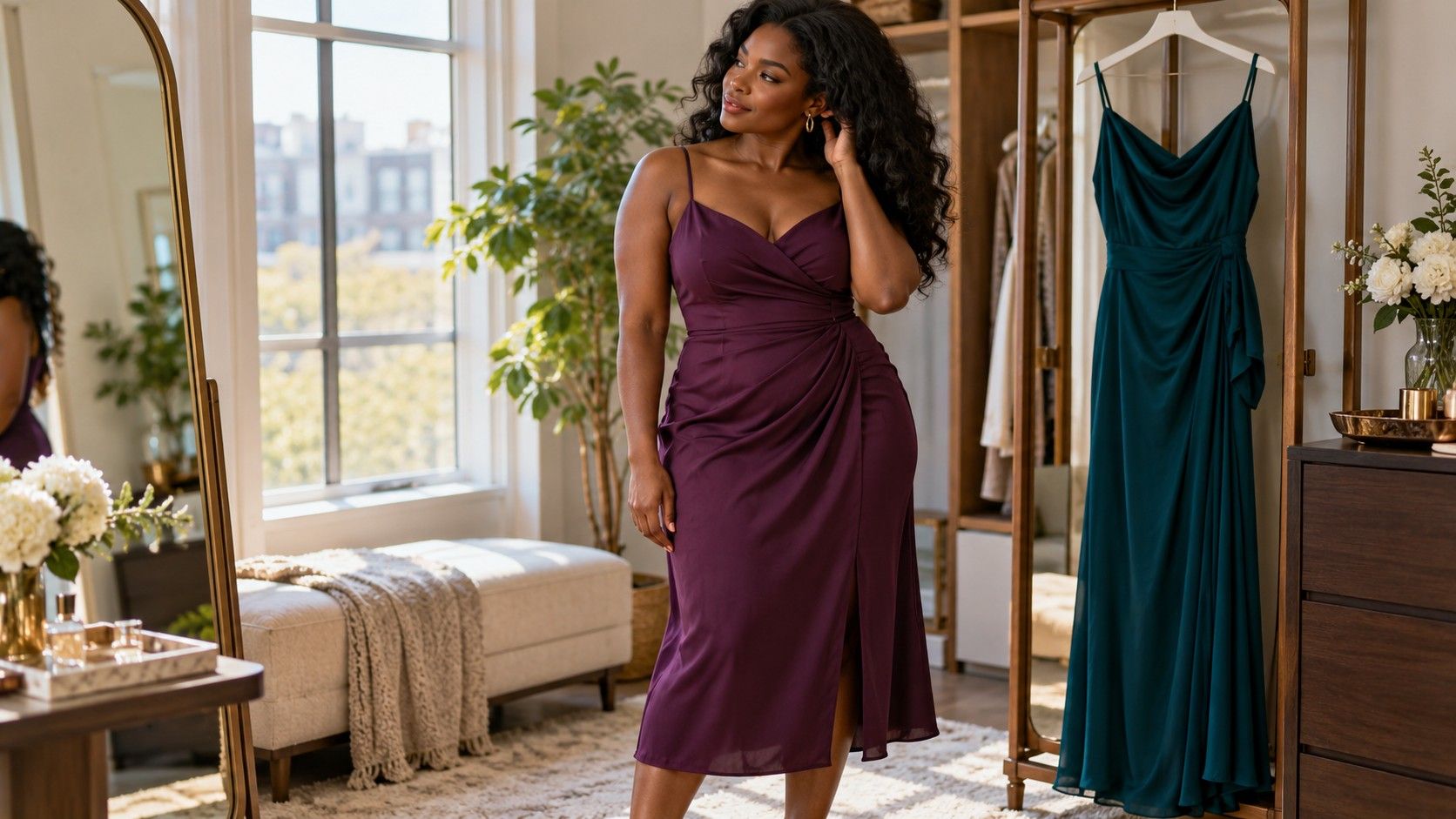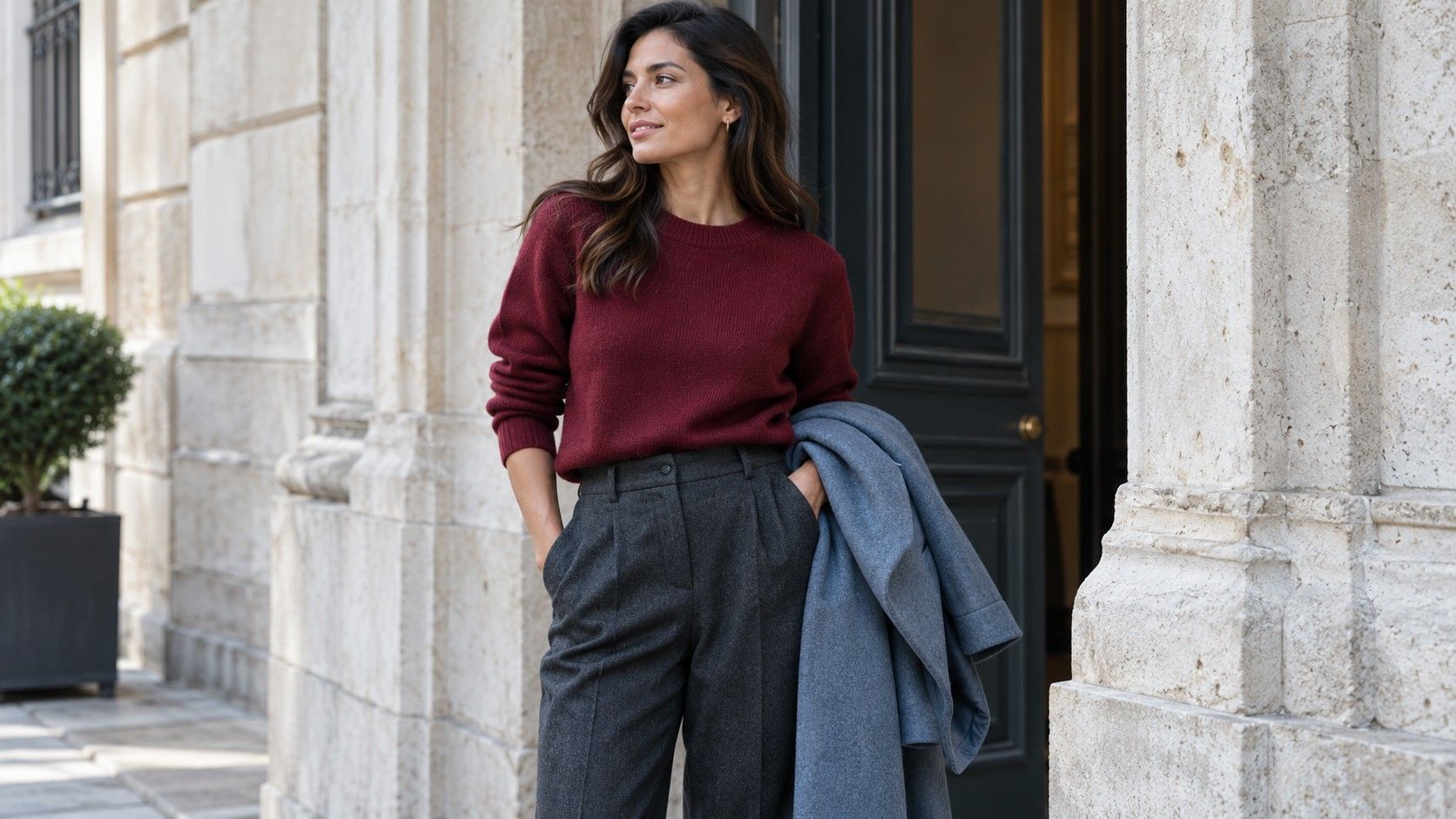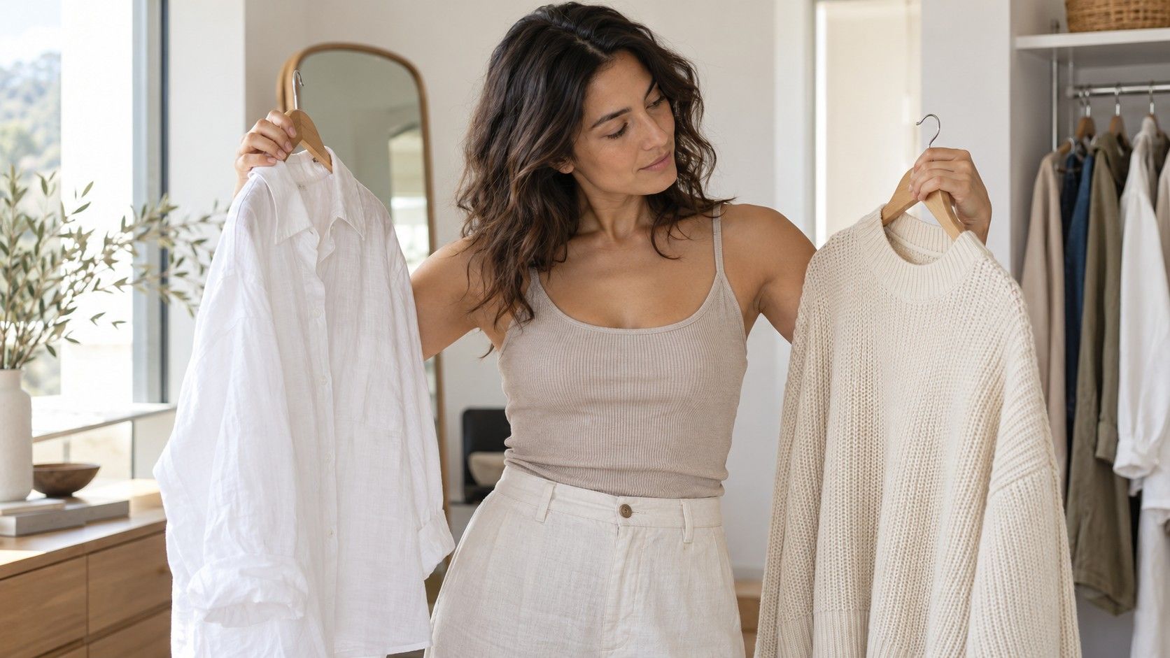
Choosing clothing colors for olive skin tone becomes easier when you compare actual garments instead of searching for a universal list. Olive is an appearance description used in different ways, and it does not automatically mean warm undertones or a particular seasonal category. A cream shirt, a bright white shirt and a gray knit can each change the overall impression beside your face. That comparison can tell you what you prefer to wear; it cannot diagnose your skin. Start with clothes in your wardrobe, use consistent light and give yourself permission to like more than one result.
Separate olive appearance from a fixed season
Olive appearance and the warm-or-cool labels used in styling are not interchangeable. People who describe their complexion as olive may prefer quite different colors, and the same person may like different contrasts for different occasions. Avoid turning a description into a command to wear earth tones or to avoid them. Your immediate task is choosing a useful outfit, not proving that a label is correct.
Begin with a garment you already enjoy wearing and identify what makes it useful. It might be a dark blue shirt with a comfortable collar, a burgundy knit that works with several bottoms, or an off-white T-shirt that suits your weekend clothes. Keep that piece as a reference while trying alternatives. A familiar garment provides a more concrete comparison than a color swatch on a screen, especially when the fabric and neckline are part of its appeal.
Surface color can look different with sun exposure, flushing, makeup or the light around you. Do not interpret every change in the mirror as evidence of a new undertone. Likewise, an uncertain seasonal result does not prevent you from dressing well. Set aside the classification if it becomes a distraction and compare two tops at a time. Describe what you see in ordinary terms: one combination feels sharper, another quieter, and one is easier to combine with your jacket.
When considering olive skin tone colors to wear, separate preference from a claim about other people. You may like a particular green because it repeats an eye color, contrasts with your hair or simply feels familiar. That is enough reason to use it. Someone with a similar complexion may dislike the same green. Clothing color advice is a framework for experiments, with personal taste and the needs of the day remaining part of the decision.
Compare white cream and gray first
Choose a white, a cream and a medium gray garment if you own them. Similar necklines and fabric weights make the comparison easier, but there is no need to acquire a special set. Hold or wear each near the face in indirect daylight, keeping your position and background unchanged. Compare pairs first: white against cream, then the preferred one against gray. Three simultaneous judgments can be harder than two simple comparisons.
Notice the outfit's overall contrast before focusing on subtle changes. Bright white may create a cleaner, sharper edge beside dark hair and trousers, while cream may feel softer. Gray could make the combination quieter still. Those are descriptions of the arrangement, not rankings of your appearance. If white is your favorite, keep it in the running even when an online palette suggests cream. A shirt you enjoy is more useful than an approved shade you avoid wearing.
Control the obvious differences where possible. A shiny cream blouse reflects light differently from a matte white T-shirt, and a deep V-neck exposes more skin than a crew neck. If one wins decisively, try another garment in a similar color before attributing the result entirely to hue. You might prefer the neckline, the drape or the amount of contrast. Fabric and cut belong in the decision rather than being treated as interference to ignore.
Test the chosen neutral inside a complete outfit. Cream with dark jeans and brown shoes gives a different result from cream with gray trousers and black shoes. Repeat the test with your usual coat or cardigan, especially if it sits close to the neckline. The neutral's job is to connect useful garments. Keep more than one if white works for a crisp work shirt while gray suits a quieter casual layer.
Test reds greens and blues in pairs
Use a red comparison to explore your preferences without trying to name an undertone. Place an orange-leaning red beside a blue-leaning berry red, using clothes or fabric you already have. Keep the visible area roughly equal. You may find one more lively, one more restrained or both enjoyable for different reasons. Do not let a single red determine an entire wardrobe; differences in saturation and depth can be as noticeable as the warmer or cooler direction.
Next compare two greens, such as a muted olive and a clearer blue-green, if those options are available. Olive clothing is not automatically required for olive skin, nor is it automatically unsuitable. Wear each with the same bottom and check the neckline in consistent light. A green that seems dull by itself may look more deliberate with navy trousers, while a bright green may need a simpler surrounding outfit to give it room.
For blues, try denim against navy or a smoky blue against a clearer blue. These comparisons may reveal a preference for depth or softness rather than a strict temperature rule. If a pale blue feels weak with pale trousers, repeat it with a darker bottom before rejecting the shirt. The relationship between garments changes the result. A useful color can look unconvincing when the whole outfit lacks the contrast you normally enjoy.
Keep notes tied to actual pieces: berry knit with charcoal trousers, teal shirt with dark jeans, olive jacket over cream. Avoid broad conclusions such as every blue is good or every yellow is bad. A name covers many fabrics and shades. The phrase olive undertone colors to wear can suggest a fixed answer, but a few repeatable combinations will help you dress more than a rule that collapses when you meet a slightly different version of the same color.
Build outfits from the successful garments
Choose one top that worked in the comparison and pair it with two familiar bottoms. A berry knit might work with gray trousers for a workday and medium-wash jeans for the weekend. Put on the actual shoes and check the proportions. The knit may need a different tuck with each waistband. An outfit that feels wrong at this stage could have a length or fit problem even when you still like the colors together.
Add a layer after the basic outfit works. A navy jacket over a cream shirt and dark jeans makes one clear combination; an olive jacket over the same base gives a different mood. Compare the jackets open and closed. The visible amount of the shirt changes, and the outer layer becomes more dominant when fastened. Choose based on the weather and the effect you prefer, without requiring every item to belong to the same theoretical category.
Create a small group of complete outfits for your usual situations: a desk day, a casual day and a meal out, for example. Record which garment goes with which, including the layer and shoes. Rewear those combinations and note what survives an actual day comfortably. A color that looked attractive in a quick mirror check is still only one part of a useful outfit. Movement, care and how readily it works with the rest of your wardrobe matter too.
Handle changing light and camera color
Use indirect natural light for your first comparison, avoiding a strong beam of sun or a brightly colored wall nearby. Then check the outfit in the lighting where you will wear it. A cream shirt may appear more yellow under a warm bulb; two dark blues may seem identical in a dim room. These changes do not invalidate your earlier preference. They show that the outfit will have more than one appearance during the day.
Phone photographs can help you remember combinations, but automatic processing can shift white balance, exposure and skin color between frames. Keep the camera position, background and lighting similar if you compare pictures. Turn off optional beauty effects where you can. Even then, do not treat the image as an objective verdict about your face or undertone. A useful photograph answers which outfit you wore and how the proportions looked, with limits on subtle color judgments.
Return to the combinations that work repeatedly. Keep the cream shirt if it earns regular use, the white one if you like its clarity and the gray layer if it connects your everyday clothes. You do not need to resolve every undertone uncertainty before making those decisions. A small set of tested garments gives you something reliable to wear, while leaving space to change your preference with the season, the occasion or simply your mood.