If camel and grey both seem comfortable near your face, a neutral undertone label can sound like permission to wear everything. That leaves the practical question unanswered: which combinations will make a useful wardrobe? Undertone labels are subjective styling tools, and liking warm and cool colors does not mean every depth, brightness or fabric will feel equally right. Start with the clothes you repeatedly choose, then look for the specific qualities that connect them.
Check what neutral means for your wardrobe
Neutral undertone and neutral-colored clothing mean different things. The first describes a way people discuss the apparent warmth or coolness of skin; the second usually refers to adaptable wardrobe colors such as navy, cream, brown, grey and black. You can enjoy a vivid green dress while preferring neutral foundations, or wear a mostly grey wardrobe without identifying with a cool undertone. Neither choice contradicts the other.
Gather four tops you already wear happily, including a warm-looking and a cool-looking option if possible. A camel knit, a grey shirt, a cream tee and a navy blouse make a useful comparison group. Try them in similar indirect daylight with the same trousers. Look for what you enjoy about each outfit: a soft boundary near the face, a dark frame, or a clear light collar may matter more than temperature.
A search for neutral skin tone colors to wear can produce long lists without explaining how to choose from them. Replace that list with a few observations about actual clothes. Perhaps grey works best when it is medium-dark, while camel works when it is muted rather than golden. Those details tell you more about the next useful top than simply declaring that warm and cool are both allowed.
Do not use a vein check, a jewelry preference or one photograph as an instruction to replace a wardrobe. Skin appearance changes with lighting, cameras and surrounding color, while a personal preference is allowed to remain a preference. If the neutral label helps you experiment, keep it. If it creates more uncertainty, you can build the same practical combinations without settling on a category.
Find the color dimension that matters more
Color has more than temperature. Depth describes the light-to-dark relationship, while chroma refers to intensity or saturation. A dusty rose and a vivid fuchsia may both seem cool, yet produce quite different effects. If one feels easy and the other feels distracting, brightness could be more useful to investigate than whether you should stay on the warm or cool side of a chart.
Compare a soft sage top with a clearer green, keeping the fabrics reasonably similar. Next compare a pale grey with charcoal. Change one dimension at a time where your wardrobe allows it, and stop short of treating this as a laboratory test. The aim is to notice a usable pattern, such as preferring medium depth with a little softness, rather than to assign a precise measurement to your face.
Contrast inside the outfit may matter as much as the individual top. A pale cream shirt with black trousers creates a stronger light-dark jump than the same shirt with tan trousers. If the first combination feels too abrupt, add a medium grey cardigan or try a darker shirt. You do not have to reject cream itself. Compare the whole outfit at a normal viewing distance before deciding which piece is responsible.
Fabric complicates the comparison in a useful way. A bright blue brushed knit may feel gentler than smooth blue satin because their surfaces reflect light differently. Look at the garment while moving, and check it under ordinary indoor light as well as daylight. Record descriptions you can recognize again, such as muted blue in a matte fabric, rather than relying on a shade name that may vary between garments.
Mix warm and cool through a bridge piece
A bridge piece gives warm and cool garments a visible relationship. A scarf patterned in navy and rust can connect a rust knit with navy trousers, because both colors appear in the scarf. Keep the rest straightforward with brown shoes. The scarf is useful only if you like wearing it and it suits the weather; an accessory that needs constant adjustment is a poor foundation for an everyday outfit.
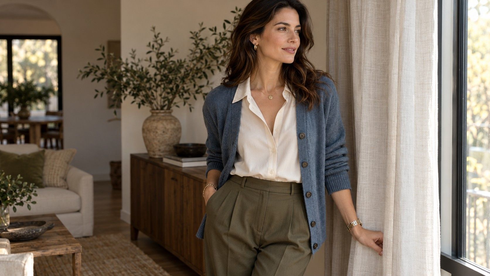
Existing prints can do the same work. Try a blouse containing olive and blue beneath a blue cardigan, with olive trousers. The print provides an explanation for the two larger color areas without matching every detail. Check which color occupies the most space in the blouse. A tiny blue dot may not visibly connect the cardigan from across a room, whereas a larger blue motif probably will.
You can also bridge with depth rather than a literal repeat. Medium grey trousers, a soft camel knit and an ivory shirt collar can form a quiet combination because none of the pieces is extremely bright. Balanced temperature here is an impression created by the outfit, not a scientific property to calculate. If the camel appears too golden beside the grey, compare a browner camel or a darker trouser before adding more accessories.
Mixed metals offer a smaller version of the same idea. A watch with both silver- and gold-colored details can sit beside earrings in either metal, but no bridge is required if you already enjoy the mix. Keep scale and shine in mind: a large polished necklace attracts more attention than small matte studs. Wear the combination with the complete neckline and hairstyle, rather than judging isolated jewelry against bare skin.
Create a repeatable outfit from your best neutral
Your best neutral is the color that works hard in your wardrobe, not necessarily the one a chart calls most flattering. It might be navy because it connects your shoes, coat and work trousers, or chocolate because you wear it with both pale blue and cream. Choose a base that already appears in at least two useful pieces. That makes a repeatable outfit possible without buying a new foundation.
For a navy base, combine navy trousers and shoes with a cream tee and camel cardigan. Exchange the tee for a pale blue shirt when you need a sharper finish; the foundation stays the same. If the cardigan feels bulky over the shirt, use a thinner layer or leave it off. The successful formula includes a workable fit, not merely four colors that look compatible on a page.
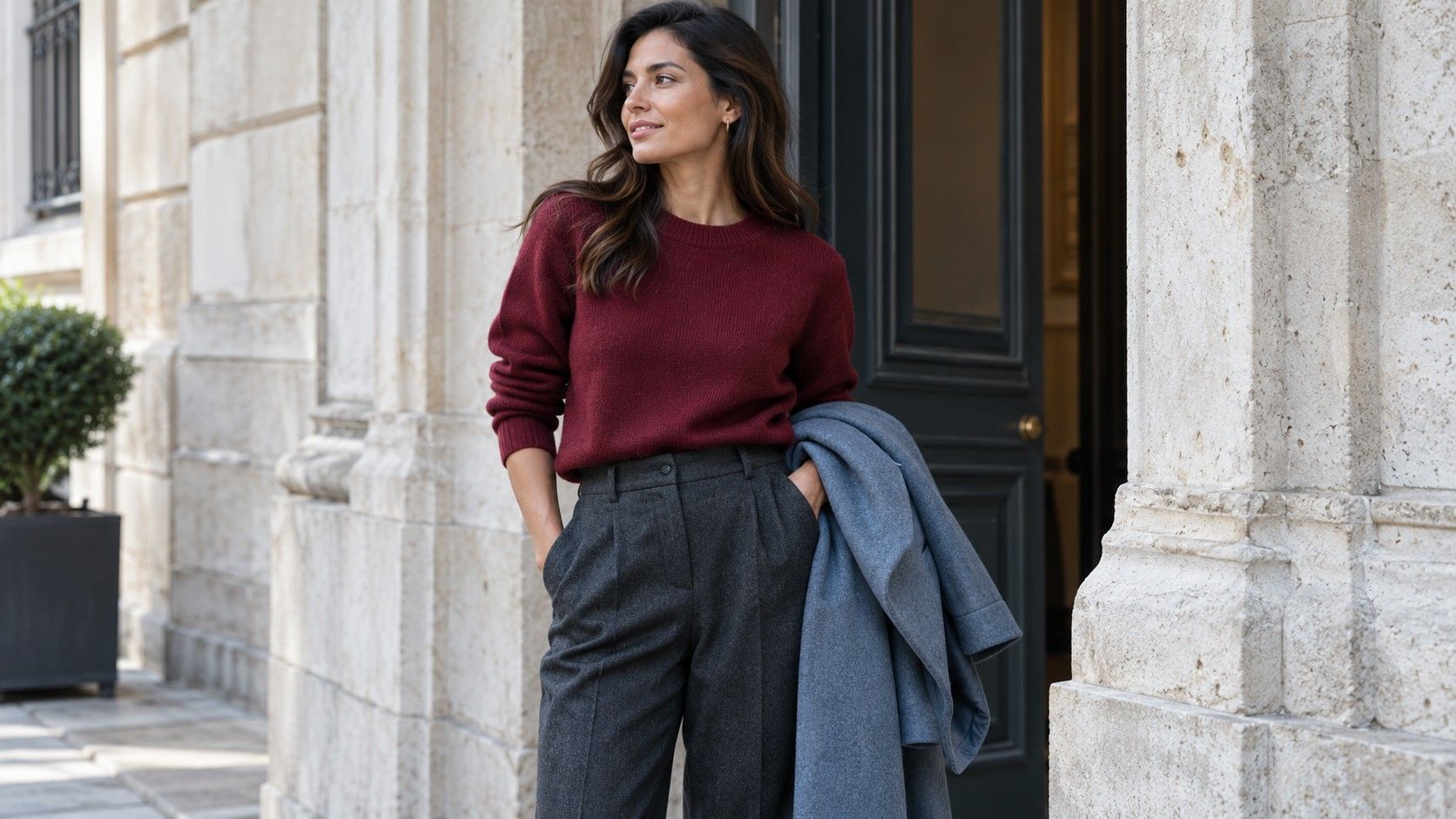
For a grey base, try charcoal trousers, a soft rose top and black loafers, then add an olive jacket. The rose supplies a lighter center while the darker pieces give it a frame. Compare the jacket open and closed, since a larger area of olive may change your impression. If you prefer the simpler version, stop at three main colors rather than adding a bridge piece just to follow a formula.
A neutral color palette clothing plan can still include clear accents. A chocolate dress with a teal cardigan, for example, is a repeatable two-piece outfit if both pieces already suit your day. Change shoes for the occasion rather than changing the entire combination. Take a photo once the hem, sleeves and outer layer are settled; it becomes a practical reference on a morning when you have little time to experiment.
Avoid buying every color a chart permits
The drawback of a flexible color label is that almost any purchase can seem justified. Before adding a new shade, name the job it will do. A muted green top that works with both grey work trousers and brown weekend jeans fills a visible gap. A third occasion blouse in a color you rarely wear may add choice without adding a useful outfit. Compatibility needs an actual garment pairing, not a theoretical palette connection.
Try a three-outfit check with a candidate piece, using clothes and shoes you already own. If the piece only works when you imagine a different jacket, different trousers and different shoes, set it aside while you test existing alternatives. This is especially helpful with unusual finishes: a shiny copper skirt may match several colors but still need a kind of top or an occasion that your wardrobe does not currently provide.
Keep notes about combinations that fail as well as those that work. Perhaps the pale top needs a smoother bra, the warm jacket feels too heavy over a cool grey dress, or the shoes interrupt the trouser line. Those are specific problems you can solve. Calling the entire outfit wrong for a neutral undertone makes the lesson harder to use and may lead you to discard a perfectly useful color.
Give yourself a small working group for the next week: two bottoms, three tops and one layer, with shoes that suit the weather. Include a warm and a cool top if you enjoy both, then repeat the strongest combinations. When a preference becomes clear, follow it without turning it into a permanent rule. The useful outcome is a wardrobe in which color decisions feel familiar enough to leave room for comfort, occasion and personal taste.