Light colors can feel fresh in a wardrobe until every outfit seems to require pale trousers, pale shoes and a coat you do not own. A light summer palette is easier to use when familiar neutrals do most of the work. Try powder blue, pearl gray and soft white in selected areas, keep enough definition to show the layers, and bring in practical darker pieces where you need them. The result can stay light overall without turning every garment into a pastel.
Build the outfit around a light neutral
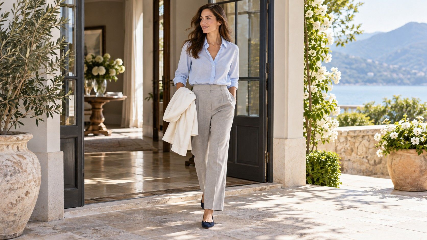
Start with one substantial piece in a light neutral: pearl gray trousers, a soft white shirt or a pale gray cardigan. Give it a familiar partner before adding another new color. Pearl gray trousers with a powder blue shirt offer a gentle combination; the same trousers with a navy top create more definition. Compare the two as complete outfits and choose the effect that suits the day.
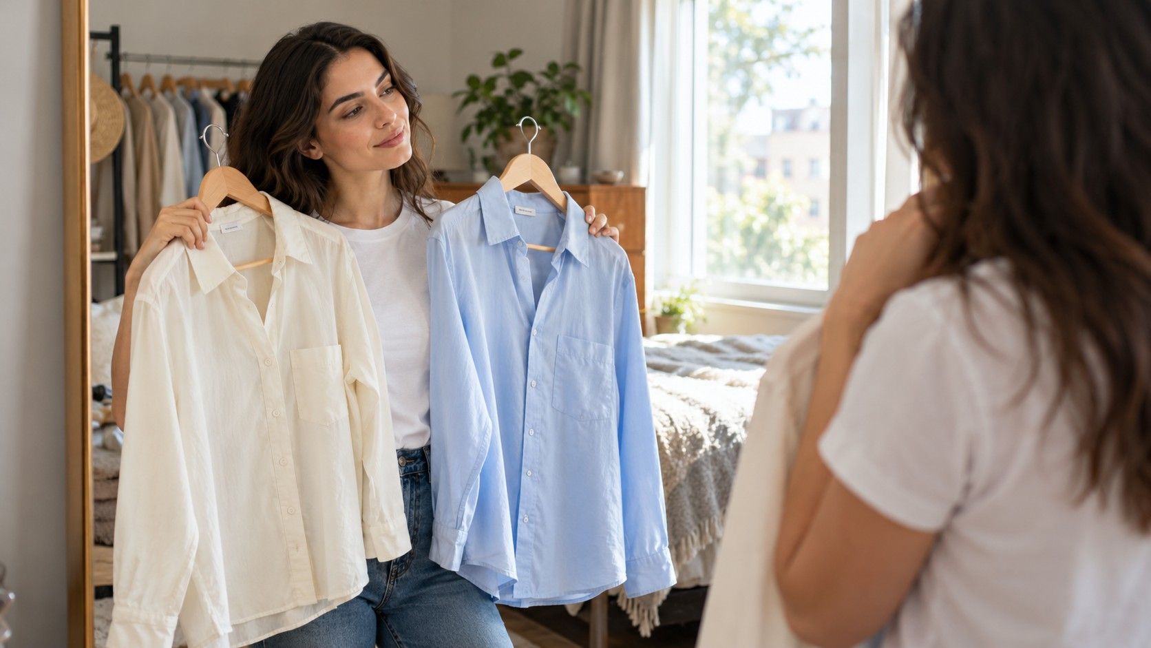
Soft white is a useful description rather than an exact shade. One cotton shirt may appear slightly gray, another creamy and another quite crisp. Place yours beside the other garments in indirect daylight. If a white top makes a pearl gray jacket seem unexpectedly dull, compare a slightly deeper shirt or show less white beneath the jacket. The label alone cannot tell you how the fabrics will relate.
Light denim can fill the neutral role when pale tailored trousers feel impractical. A light blue jean with a soft white knit gives you a simple base for a rose scarf or gray jacket. Check the denim wash across the whole leg: a pronounced faded patch can create more visual contrast than the overall color suggests. That may suit a casual outfit even when it would distract from a cleaner work combination.
You do not need every large garment to be light. If your reliable trousers are navy, use a light top and a pale open layer to place more light color across the upper half. A light jacket worn open also shows the darker center underneath. The balance comes from the areas visible while wearing the clothes, rather than counting how many pale items appear in the outfit.
Give blue and rose a clear everyday role
For everyday light summer color palette outfits, powder blue and a softened rose are straightforward colors to compare with gray, white and denim. Begin with one of them as the main colored piece. A powder blue shirt with gray trousers needs little else; a rose knit with light denim can be equally complete. Add the shoes and bag you already use before deciding whether the combination needs another color.
Wearing blue and rose together works more easily when their intensities feel related. A muted rose cardigan may sit comfortably over a pale blue shirt, while a very vivid pink can become the clear focal point. Both are possible choices, but they produce different effects. If the two garments compete, let one show only at a collar or sleeve, or separate them with a plain gray layer.
Try a repeatable formula based on color proportion: one light neutral covering a large area, one soft color in the next largest area, and a smaller grounding detail. Pearl gray trousers, a rose top and medium gray shoes follow that order. Reverse the proportions with a gray dress and a small rose scarf if you prefer less color. The same shades can feel noticeably different when their coverage changes.
| Situation | Light base | Color to add | Practical finishing piece |
|---|---|---|---|
| Everyday errands | Light denim | Powder blue knit | Familiar gray or navy walking shoes |
| Office with relaxed tailoring | Pearl gray trousers | Soft rose shirt | A navy jacket for cooler rooms |
| Lunch outside | Soft white top | Pale blue skirt | A mid-gray cardigan carried as a layer |
| Evening indoors | Light gray dress | A small rose accessory | Darker shoes repeated in a bag or belt if desired |
Use these combinations as starting arrangements, not as requirements. A skirt hem, shirt shape or fabric finish can change the balance more than a small difference in shade. If you already own a similar outfit that feels comfortable, alter one piece at a time so the comparison answers a clear question.
Keep enough definition around the face
Several very pale layers can merge at the neckline. With a soft white shirt beneath a pearl gray cardigan, check whether you can still see the collar and edge of each garment. If the combination feels vague, try a slightly deeper blue inner layer or open the cardigan farther. A narrow band of darker fabric may provide all the definition you want without changing the overall light impression.
Neckline shape also changes the effect. A high pale collar creates a broad light area close to the face, while an open shirt collar breaks that area into smaller shapes. Try the garment in its normal position, then adjust one button or fold before deciding about its color. A preferred shade can feel wrong simply because the fabric covers more of the neck than you like.
A scarf or small pattern can supply a clear edge, but watch its scale. A fine blue stripe on soft white gives the shirt definition across its whole surface. A large dark check introduces much stronger contrast. Hold the patterned piece at its expected position and look from several steps away. The useful question is whether its pattern supports the rest of the outfit or becomes the main event.
Keep any seasonal label provisional. You may enjoy a dark navy neckline despite liking pale colors elsewhere, or prefer a clear blue to the softer one often shown in a palette. Your mirror can help compare actual garments, but it cannot produce a scientific verdict about a fixed category. Choose the contrast that you like for this outfit and this occasion.
Work with dark shoes and useful outerwear
Dark shoes can look abrupt beneath a pale outfit because they create a strong boundary at the feet. First check their visual weight: a slim dark shoe and a heavy black boot behave differently, even when their color is similar. If the boot is needed for the weather, compare the outfit with a darker trouser or let a dark detail higher up echo it. A navy bag or belt can provide a connection without matching exactly.
Another option is to accept the contrast as part of the design. A light blue shirt and gray trousers with black shoes can look clear and practical. The outfit does not have to resemble an uninterrupted wash of pastel. Before changing anything, stand far enough from the mirror to see whether the dark shoe actually distracts you or merely differs from a reference image.
A navy raincoat can sit comfortably over light denim and a pale knit, even though it covers much of the light palette outdoors. Leave the preferred neckline visible when weather allows, then check the indoor outfit separately. This avoids choosing a delicate pale coat that does not suit the journey. The clothes should work at the bus stop as well as after you arrive.
For bags, compare the largest visible panel with the garments beside it. A medium gray bag often makes a gentler transition than a large black one, but shape and surface matter too. A small black bag may be less dominant than a broad shiny pale bag. Try what you own against the full outfit, with the bag held where you normally carry it, before making a judgment from color names.
Check pale fabrics in the conditions that matter
Pale fabric deserves a coverage check before a full day out. Look at a soft white shirt over the underlayer you intend to wear, then move from the mirror near the window to an ordinary indoor room. A fabric can appear more transparent when backlit. With trousers or a skirt, check sitting and bending as well as standing; pockets, lining edges and seams can become more visible when the fabric stretches.
Surface condition affects the impression of light colors. Creasing, pilling or a slightly stretched neckline can be easier to notice on an otherwise simple pale outfit. These are garment issues rather than proof that a palette does not work. Compare the pieces after the care you normally give them, and choose fabrics whose upkeep fits the way you actually dress.
Take a phone picture if it helps record the proportions, but be careful with subtle color differences. Automatic white balance may pull rose toward peach or make soft white look cooler. The photograph is useful for seeing how much light and dark fabric appears; daylight comparison is better for judging the relationship between the actual shades. Repeat an uncertain pair before discarding a useful garment.
Save two or three successful formulas with the finishing pieces included. “Pearl gray trousers, powder blue shirt, navy shoes and jacket” is ready to use. Record an adjustment such as an open collar or visible shirt cuff if that was what gave the layers definition. A small set of complete outfits makes the light palette practical while leaving space for the darker clothes you still need and enjoy.